Five Miscellaneous Updates

I’ve done a handful of updates the past few months and I realized I should probably document them somewhere, as people interested in this site aren’t going to periodically comb through the whole thing to see what’s new. So without further ado, here’s what’s new.

Text to ASCII Art Generator

For TAAG, I had a user request the ability to copy TheDraw output as bash commands so that the text could be used in bash scripts. I thought that was a great idea and added it to the app.

Image

I also made some UX adjustments for mobile, as previously the app wasn’t very usable on mobile.

Arial ASCII Art Gallery

The Arial ASCII Art Gallery now has 1,500 different pieces. The sheer quantity of what’s in there is starting to rival some of the normal ASCII art archives out there, and I would say the quality of what’s in the Arial ASCII Art Gallery is pretty high. The biggest problem now is discover-ability.

Image
A handful of pieces from the gallery

However, I’m not completely done populating the gallery, I’ve been holding off on talking about this until I’m done, but essentially I used Claude to help me create a script to analyze 1000’s of old AOL progs to extract out what might be ASCII art. Most of what was extracted was random characters, but there’s a lot of cool art that got pulled out too.

So I’ve been going through files and if the extracted data is in fact a piece of ASCII art, I add it to the gallery and note the artist’s name. The process has been slower than I expected, but I don’t think a lot of this stuff has seen the light of day in decades.

Anyway, I still need to finish going through the output, then I want to redesign the app, and then I want to improve discover-ability. Once I’m done all of that I’ll do a full write-up here. In the meantime you can check out the app to see the current progress. I periodically update it, and you can tell when this happens because the count at the top will update.

Snake

I’ve updated my Snake game to use TuiCss for its dialog boxes. TuiCss is a UI library for creating MS-DOS-like interfaces. I’ve been meaning to do this for a while, but at the same time I’ve been really hesitant, since the game has had the same look and feel for 18 years. However, this game is mostly here to remind me of my high school days when I would goof off. It’s just a fun little nostalgia trip, so I figured the update made sense. Earlier this year I also updated it to work on mobile.

Image

Image Glitcher

I’ve made some quality of life updates to Image Glitcher. You can now load any type of file into the hex editor, and a number of other small updates have been made. I want to re-visit this app later to support other file types, but I’ll circle back to that later.

Monster Eyes / Main Page

Back in 2022 I made a silly Halloween themed react library, full of Halloween decorations for websites. One of the components was a set of eyes that watched the cursor as it moved around the screen. I thought it would be fun to dust those off and place them around the main site. I’ve set it up so that if you’re in dark mode, as you scroll down the page all of these eyes will open and start watching you.

Image

It amuses me, though I have no idea what actual visitors think.

For some unknown reason, ChatGPT thinks this site has something to do with The Matrix

A few months ago I noticed something mildly interesting that seemed both obvious and confusing: ChatGPT had been linking users to non-existent locations on this website. Now, chatbots hallucinate all of the time, so it makes sense that they would just make up URLs and provide them to users. But what was confusing to me is that most of these phony URLs were related to the movie The Matrix. Below you can see a table of the most common chatbot-related 404s I received for the first six months of this year.

Page PathChatbot SourceViews (Visits)Notes
/matrix/chatgpt.com46Most frequent broken link
/misc/matrix/chatgpt.com25
/matrix-effect/chatgpt.com18
/software/tchatgpt.com14Partial/broken URL
/taag?spm=…qianwen.com11AI assistant from Alibaba
/text-animation/chatgpt.com11
/birthday/chatgpt.com7
/experiments/heart/chatgpt.com7
/games/asteroids/copilot.com7Microsoft AI referrer
/games/heart/chatgpt.com7
/romantic/chatgpt.com7
/text-scroller/chatgpt.com7
/ascii-art-generator/gemini.google.com4Google AI referrer
/image-animator/chatgpt.com4
/led-banner/chatgpt.com4
/misc/matrix-code-rain/chatgpt.com4

In addition to the above table, there were also a bunch of one-off broken links like /software/bauklotze/cmatrix/. 

Now, I have nothing against The Matrix, it’s a fine movie, but this website is mostly random apps I’ve developed over the years and legacy programming content. I don’t remember ever talking about that movie here. Nor do I remember talking about it anywhere online. After poking around, the closest thing I could find was a comment someone made on one of my blog posts many years ago where they mentioned the movie in passing.

So, what gives? Why The Matrix? Well, this is where things get a bit murky. When I asked directly, ChatGPT told me it’s because of connections and themes throughout my site. It noted that “matrix rain” is a common thing for programmers to build and that my site is “strongly associated with visual/programming experiments”. It also noted that the site is associated with text art, which is associated with the terminal, which is related to digital rain. So if this is to be believed, it sounds like ChatGPT is connecting dots that maybe shouldn’t be connected.

This explanation mostly makes sense, but when it comes to LLMs, convincing answers are what they’re best at, so they should be taken with a grain of salt. When I asked Gemini it actually gave me a slightly different answer and noted The Matrix-like configurations in my Keyboard Layout Analyzer and its “Neo” layout. It also pointed out I have a “Matrix” theme in my Snake game (something I’d forgotten about, as that theme was user submitted). So again, connecting dots that shouldn’t be connected, but different dots this time.

Whatever the case, it’s amusing, and from what I’ve read online this is a known issue. Lots of sites apparently have LLMs sending them traffic to spots that don’t exist. In fact, many SEO experts recommend putting up some content to catch these users so they’re not dumped onto a 404 page. I figured I would follow this advice, so in August I created a digital rain page and directed all Matrix-related traffic there. However, I apparently acted too late, as sometime in July ChatGPT mostly stopped hallucinating Matrix-related URLs for this site. This seems to coincide with GPT-5.6, so I’m assuming something in an earlier model mistakenly connected my site to the movie.

It makes me a little sad I missed the boat on capitalizing on this, but I’m glad to have stumbled upon it. At the very least it was amusing seeing all of the fake URLs LLMs had generated for my site. I don’t know if newer models will hallucinate URLs as much as their predecessors, but maybe this is a lesson that I should pay better attention to my analytics. And even if these URLs were strange and unrelated to what I post here, each broken link represented someone who was looking for something, and after crunching all of the data in the world, ChatGPT thought they would find it here.

Adding Custom Filters to Old School Gaming Filters

I’ve updated my Old School Gaming Filters app to allow you to create your own filter. You simply select a reference image, a dithering algorithm, a number of colors, a resolution, and voila, a retro looking image:

Image

If you follow this site closely, you may know that this is actually exactly how the Palette Swap app I made a decade ago works. And somewhat amusingly, the Old School Gaming Filters app is built on-top of that old app. It’s just using presets instead of letting you pick your own inputs.

So why wasn’t this feature in the original app? Well, according to my original write-up on the app, I felt it would be too complicated and that premade filters would be easier to understand. I mentioned the Palette Swap app in passing at the bottom of the post and then promptly forgot about it. And when I say forgot about it, I genuinely forgot it existed.

When I did the UI update to the Old School Game Filters app last year I simply renamed the old folder and uploaded a new one, one that didn’t include Palette Swap. To my surprise, a week after I did this I got an email from someone asking me to please restore the Palette Swap app. I was confused, and it wasn’t until I checked the old folder that I found it and realized what they were talking about. I hadn’t thought about that app since I’d posted the original blog entry.

I restored Palette Swap, but I made a note to myself that I wanted to add its features to the main app. If someone had bookmarked it a decade ago and was still using it, maybe there was something to this custom filter idea that I’d just causally discarded.

And then, because I have a really short attention span, I kept forgetting to do the update – until today! And I think the app with this feature is waaaay better. This is really how it should have been released. It’s much more fun to create your own filters from reference images and dithering algorithms than it is to use a preset.

Image

The outputs don’t always make sense, but they have a wonderful retro charm to them.

Anyway, if you have a moment check out the app and let me know what you think!

Updated Typing Speed Test

I’ve updated one of the oldest apps on this site: Pat or JK’s Typing Speed Test

Believe it or not, the old version was from 2008. At that time there weren’t any good free online typing tests. It’s biggest claim to fame was being mentioned in passing in a VSauce video, which was really cool. Over the years way better typing tests have been created, and I’ve debated retiring the app, but I felt with some adjustments it could be worth saving.

The new version does away with the draconian strictness of the old test, where you had to correctly type a word before moving on. There are also a number of UX improvements, including splitting the configuration between the opening title card and the results screen. Previously all of the configuration was on an easy-to-miss tab.

All of the end stats are the same, though now you get a “ranking”. This can be 1 of 16 different (mildly) humorous titles. They’re a handful of 80’s references and other silly things. I also updated the heat-map. I was originally going to use the famous heatmap.js library, but that hasn’t been updated in over 10 years. I wound up turning to Claude, which created me a modern version of the library.

It worked like a charm, though it makes me wonder if there will even be coding libraries in the future. This time last year I made a video poking fun at how AI couldn’t understand ASCII art, but today it can easily parse and understand text art. Some of my coworkers are convinced us software devs are “cooked”, but I think the job is just going to change.

Anyway, I’m getting way off track. I just wanted to make a post saying I’d made an update.

New UI for Chain Letter Archive

I’ve revamped the UI for my Chain Letter Archive.

Image

It’s modeled after an old AOL 4.0 inbox. I used AOL 4.0 with NINA for reference when making it, as well as the 98.css project. Icons are courtesy of svgrepo.com.

Each chain letter is an email inside of the inbox, and clicking them opens up the chain letter in an email message.

Image

The sender list is mostly just inside jokes. I debated adding more inside jokes in, like making the “Reply” and “Reply All” buttons actually do stuff, but I decided to hold back for now.

I actually really like how this turned out. When I did the original revamp last year I kept second guessing myself. You can see the old design below.

Image

In that case I was going for a Geocities-like feel, but I think I missed the mark. The site was ugly and it wasn’t clear that it was done on purpose. Doing bad design right is actually kind of hard.

Anyway, for the new site I actually found an 2 additional chain letters that I had saved on my old geocities website that I hadn’t posted in the archive. So the archive now contains 7 letters. That’s not a lot, but I think one gets the gist for what a chain letter was after reading through a few of these. My original collection was around 10 letters, but over time the ones I didn’t post online got lost.

When I was originally collecting these I was only trying to save the good ones, which were few and far between. And then once the 2000’s hit, it seemed like these kind of letters completely disappeared.

At the time these kind of letters mostly annoyed me, but I found myself getting oddly nostalgic for them when I was putting this together. Anyway, I hope the site can provide some amusement.

Adding TheDraw Fonts to TAAG

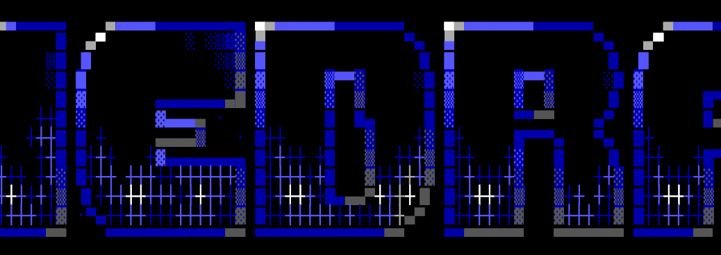
TAAG now has full support for TheDraw font files, color and all.

Image

A little over 12 years ago, someone sent me a zip of old ANSI art fonts. I converted a handful of them to FIGlet fonts (basically the ones that didn’t use color), and added them into TAAG. I have always wanted to revisit the format though, as there were so many fonts created for it, and earlier this year I decided to go back and properly add support for it. 

TheDraw?

TheDraw was a 1980s DOS app for creating ANSI art. You can think of ANSI art as ASCII art’s more handsome sibling: an extended 256-character set instead of ASCII’s 128, along with 16 colors. Though nowadays ASCII art is made with unicode and text can be colored however you want, so these benefits are moot. But back in the days these benefits distinguished it from ASCII art. Artists made ANSI art fonts in the 80’s in the same way they would later make ASCII art fonts for FIGlet in the 90’s and on into today.

TheDraw’s font format had the advantage of color and more characters, but it was less sophisticated, and it lacked features such as kerning. It also had hard limits in certain areas. For example, fonts couldn’t be larger than 12 characters high. I would argue FIGlet’s format is better, but I do really like the color and art style of TheDraw’s fonts.

The TAAG update

I silently made the first update for this several months ago, adding the new fonts to the drop-down list but not to the Test All page. Then in May I added them to the Test All page. I haven’t heard a peep from people who use the app, but hopefully these new fonts provide some enjoyment.

I know it seems really late for me to do a write-up on this, and I’d meant to post a blog or make a video sooner, but life has been crazy (though then again, when is life not crazy?). Additionally, videos kind of need a story, and I couldn’t figure out how to frame this one.

Also updated

The AOL macro fonts in TAAG are fixed. You can now see them again in their full ’90s glory. That’s a longer story for another day though.

Image

Also, the Arial ASCII Art Gallery has gotten some major updates and will be getting more in the near future, but again, a story for another time.

Image Generation Loss Experiments

I keep a running list of random ideas in a gmail draft. Whenever I think of something mildly interesting, I jot it down so I can revisit it later. Most of the ideas aren’t very good, but every so often there’s a gem. Lately I’ve been working through some of them with Claude Code*, which is great for prototyping and quickly killing the ones that don’t pan out.

One idea on the list was JPEG generation loss. I’d seen a few demos years ago and thought they were fascinating. Claude told me it was a good idea and that I’d see the image decay with each save. That sounded good to me so I asked it to create a script, but it didn’t work. There was no obvious generation loss, even after 1000 saves. However, I remembered seeing demos showing jpegs disintegrating, so rather than dismiss the idea like I had others from the list, I tried making a script by hand, but that also didn’t produce the expected results. Then I tried making a Photoshop plugin (maybe there was something wrong with the libraries I was using?). But that also didn’t work.

Finally, out of frustration, I went back and found and rewatched the old demos that had originally piqued my interest, and I noticed they were randomizing the quality setting between saves. Changing the quality changes the quantization table, so that forces the data to be crunched differently between each save, which is what was causes the generation loss. The other demo I remembered wasn’t doing this, but there was someone in the comments saying that the generation loss shouldn’t occur (jpegs stabilize fairly quickly after repeated saves), which matched up with what I was seeing.

I didn’t find the idea of randomizing the quality to be very interesting (even if the effect was cool), so I decided to just start messing around. One idea that led to really cool results was saving an image as a jpeg, then as a lossy webp, then as a lossy avif, and then just repeating this. The image ended up melting into a magenta soup. Once I saw that, I felt I had something neat enough to be worth sharing. I made a short little video on it, you can see it below if you’re interested.

If you enjoy it, a like helps more than you’d think. And if you want to play with the script yourself, I’ve put it on GitHub: https://github.com/patorjk/image-generation-loss 

* I may talk more about this later. I’m still pretty new to this and am probably behind the curve.

Chromostereopsis

Chromostereopsis is an optical illusion most people experience where red appears closer than blue. Most of the time your brain corrects for it, but you can trigger the effect with certain types of images. I made a game of Lights Out around the illusion, which is a game where you try and turn off all of the squares by clicking them. To me it looks like the squares get pushed back, it’s kind of trippy. Though the effect is stronger for people with glasses that correct for myopia, which I wear.

The idea to experiment with the effect came to me back in December, when Loic Cressot (author of a few FIGlet fonts) emailed me with the idea to add a chromostereopsis filter to TAAG. I did so and I think it makes for a neat output, though in practice I’m not sure how useful this will be.

Image

I also thought it could make for a fun youtube video topic. At the time I was working on the Image Glitcher stuff, but figured I would circle back to it. You can check out the video below.

The video isn’t really computer science related and I was worried it might flop with my audience. I was also a little worried about how it would do since it seems like around 30% of people don’t experience this illusion.

It seems to have done fine though. However, the most popular aspect seems to be the game of Lights Out that I created using the effect. I kind of wish I’d lead with that. When constructing the script, I had no idea where to place that part, so I just stuck it at the end.

Anyway, if you like it please give it a like or a hype! It definitely helps with the algorithm.

Breaking PNG Files

New video! This one is sort of a follow-up to my last video, though this time I explore breaking PNG files.

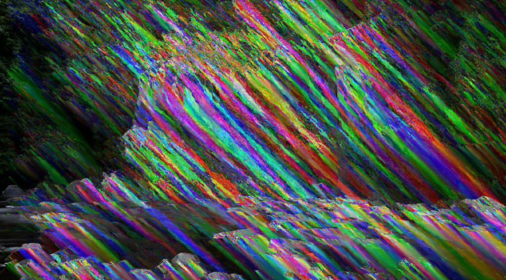
This topic proved to be a bit more complex than the last one, and one negative is that the coolest stuff is at the end of the video, which most viewers won’t see. Essentially, you can create “fake” or “custom” filters and see what errors/glitches look like by re-encoding the glitched data back into scan line space and then re-encoding it using a real PNG filter. If what I just said made no sense, well, that’s why it’s near the end of the video. But below I’ll share a few images from my favorite custom filter.

Image
Image

Those don’t even look like images with glitches to me. They look like images that have had paint splatted on them. And the fact that you can create any filter you want and glitch it is really fascinating. It feels like there’s so much that could be explored here.

Another topic near the end of the video is glitched animated PNG files. Most people probably don’t even know that animated PNGs are a thing, but they’ve had full browser support since 2020. They weren’t officially recommended by the W3C until last year though. Apparently the PNG Development Group didn’t want animation to be part of the spec (until recently). However, I think it’s a big win for PNGs to support animation. They’re smaller, support more colors, and have better transparency support. Plus, they look cool when they’re glitched:

Anyway, check out the video if you’re curious as to how all of the works. If you’re interested in my inspiration, see The Art of the PNG Glitch, and if you want to glitch your own images check out my Image Glitcher or this script I created to glitch images (the latter allows for more fine grained control).

2026/02/13 Edit: Pressing the “Hype” button on a video really helps it. If you found this interesting and enjoyed the video, please hype it (the button only appears on mobile)!

Image Glitcher: An online glitch art editor

I’ve created a new app for this site that allows you to easily create glitch art: Image Glitcher

It’s a simple tool that combines an image preview with a hex editor that has segment highlighting for jpeg images. In the future I hope to support highlighting for other formats too. The idea is that you can more intelligently make glitches in an image file when you know what you’re editing.

I created a short video about the tool framed around the idea of what happens when you edit a jpeg in a text editor. You can watch the video below.

This video was a lot of fun to research. Weirdly the research phase has consistently been the most fun part of the video making process. Originally I was going to cover all of the main image formats in this video (jpeg, png, bmp, gif), but jpegs wound up being much more complex than I anticipated.

There’s also a lot of weirdness with the file type that I opted not to cover in the video (I wanted to keep things focused). For example, you’ll often hear that jpeg’s use the YCbCr color model (basically luminance + color), but that’s not mandated by the spec. It’s actually color space agnostic. You can actually create a jpeg where it internally stores the data as RGB values (though jpegs usually store the data in YCbCr).

You’ll also often read that the two most popular formats of jpeg – JFIF and EXIF – are incompatible with each other. This seemed really confusing to me until I saw the color coded segments in the editor. JFIF is determined by a JFIF APP segment following the SOI marker, and EXIF is determined by an EXIF APP segment following the SOI marker. Jpeg parsers should have little issue differentiating them. Though possibly even stranger, you don’t even need this segment in a jpeg. Wikipedia often strips it out.

Anyway, there’s a lot of random info I left on the cutting room floor. Maybe one day I’ll work it into something else.

web apps, programming talk, and random thoughts